Recently graduated Geothink student Julia Conzon (McGill University) has recently returned from the State of the Map conference in Brussels, on a travel grant. Julia was able to meet individuals interested in different social, political, and technical components of OpenStreetMap, which solidified her beliefs that the success of volunteered geographic information relies on both social and technical fields. Julia’s interests in mapping include: increasing diversity to reduce the digital divide and harnessing government support.
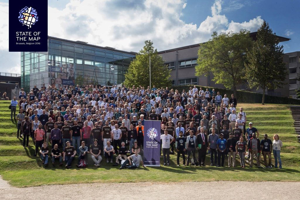
SOTM group photo (photo by Tatiana Van Campenhout)
By Julia Conzon
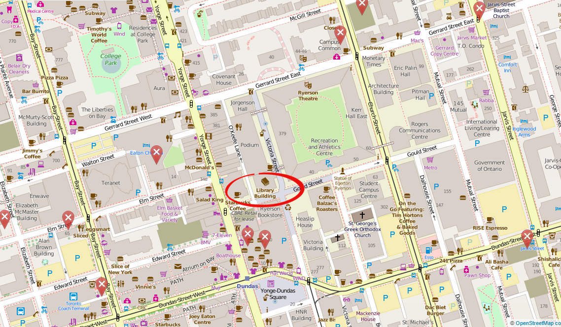
I recently attended the State of the Map (SOTM) in Brussels, Belgium. SOTM is a conference that discusses various social, political, and technical components of OpenStreetMap (OSM), a mapping website that aims to map all of Earth’s landscapes, such as social and physical infrastructures. You may wonder, doesn’t Google already do this? In short, yes, Google has done an efficient job producing Google Maps and its associated routing/navigation software; but it still has its limitations. First, Google Maps has several unmapped locations. As addressed by SOTM’s keynote speaker Allan Mustard, US Ambassador to Turkmenistan, if you compare the map of Ashgabat, Turkmenistan, between Google Maps and OSM, you will certainly see a difference (Figure 1). Secondly, Google’s spatial data is not open, which hampers equality and empowerment. Thanks to Ambassador Mustard’s initiative to use OSM, he and several Ashgabat locals have mapped out the remote city and now the citizens can use this open spatial data for various socio-economic purposes. For example, prior to the OSM maps, Ashgabat taxi drivers did not know where all the gas stations were located. Now, with a local map openly accessible to all citizens, Ambassador Mustard says taxi drivers are more efficient at navigation. In short, OSM provides an open-source platform that allows worldwide internet users to contribute geographic features of anywhere from anywhere, which then can be freely downloaded by anyone to use.
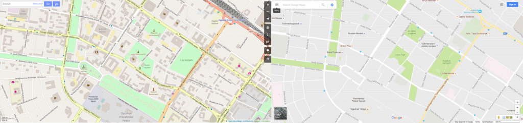
Figure 1. Differences in Ashgabat between OSM (left) and Google Maps (right) (screenshots from OSM and Google Maps)
Government Support
As seen with Ambassador Mustard, there are some within government who do support crowdsourced mapping initiatives. With Federal funding, Statistics Canada has announced a pilot crowdsourcing project starting in October 2016 to use OSM’s platform to crowdsource building data. It was also exciting to see the government presence at the conference (such as a member of Statistics Canada) and government partnerships such as between Etalab (a French government organisation) and OSM France.
Through one of the Birds of a Feather (BoF) discussions I participated in, it is apparent that OSM’s platform is positively reshaping certain government’s perceptions on how to produce open data. However, a presentation from Usman Latif, a journalist from Pakistan and the founder of Open Humanitarians (formerly DigitalHumanitarians.pk), reminded the SOTM audience that not all governments are democratizing their data. In Pakistan, broad laws have made unauthorised mapping activities by locals illegal. Usman risks penalties if he encourages local mapping, but he explained that to follow the law, he encourages students and youth to map parts of the world outside Pakistan and “to be a part of a global humanitarian society.” Usman’s goal is to proliferate a vibrant community of humanitarian mappers in Pakistan who can eventually use their mapping skills to participate in the global humanitarian society, particularly in disaster response. With Pakistan prone to earthquakes and floods, Usman hopes these educated Pakistanis will contribute to domestic disaster responses once Pakistan opens up local mapping. With this mindset, Usman now educates university students in Pakistan on using OSM. Although not all governments are supportive of open spatial data, Usman’s goals illustrate how educating locals about OSM and encouraging them to contribute to global (digital) humanitarian society can promote local empowerment, something I believe is a worthwhile alternative.
Smart Cities
Apart from social and political components of OSM, many presentations also addressed technical components; more specifically, new automated tools for OSM users. Some of these tools can be used to promote smart cities. Christian Quest and Michel Blancard from Etalab presented OpenSolarMap (view Figure 2). This presentation discussed using machine learning to identify which rooftops throughout France are most suitable for solar panel instalment based on rooftop aspect direction (north, south, west, east, or flat). Although there are still some variables that are excluded (e.g., solar intensity or rooftop angle), the software does highlight a more efficient methodology.
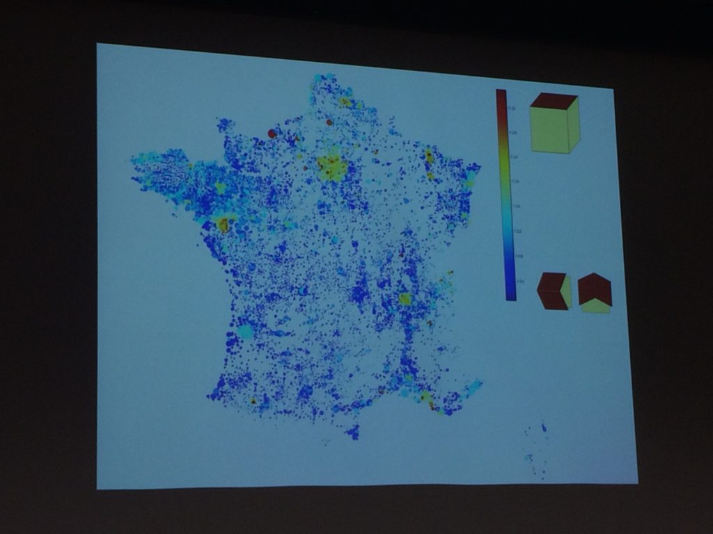
Figure 2. Etalab’s map visualization of rooftop directions (photo by Julia Conzon).
There were also three presentations proposing different methods to map indoor areas. Indoor data can be used for a series of smart city applications, such as geomarketing. For instance, a mobile app could link indoor routing with a store’s product information to direct a customer to the product they want in the store while also encouraging them to pass by other similar products. Although each presentation proposed slightly different methodologies to map out indoor areas, all three shared similar concerns on mapping certain features, such as whether a stairway takes you up or down a floor. There were also different stances on opening up the indoor data to the public. For example, French National Railway Company (SNCF) have mapped the interiors of all popular stations in Paris; but, instead of this data being openly accessible to the public, they combined their data with OSM data to create an app that provides maps of these stations’ interiors. Unfortunately, this app is not available for free, which disappointed myself and my neighbouring audience members. On the other hand, Roland Olbricht’s and Roland Wagner’s workshop taught the audience how to map building interiors with OpenStationMap, which is an OSM project that aims to incorporate indoor mapping onto OSM’s station polygons. As Google Maps has also introduced indoor mapping, Carto Cité’s presentation on indoor mapping reminded the audience, ‘We can’t leave it all to Google’ (Figure 3). If we leave indoor mapping to a few corporations, data accessibility may be restricted for commercial interests.
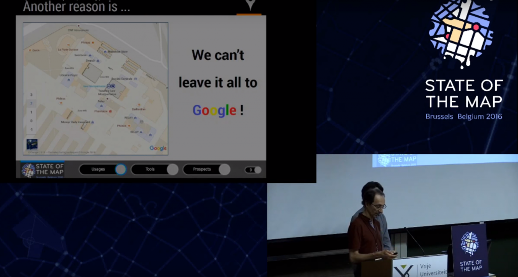
Figure 3. Indoor mapping efforts should not be undertaken by only a few actors (screenshot from YouTube)
Conclusion
Overall, the State of the Map presented two trends: collaborative learning and machine learning. The latter trend reflects discussions on automation of mapping processes, while the former trend reflects discussions on on-the-ground mapping with locals. Although these trends seem diverging, OSM’s platform is capable of incorporating both. As OSM Foundation’s Mikel Maron mentioned, it is about being “a part of the database.” Whether it be building technical tools to ease mapping complex areas or educating locals to contribute geospatial data, both trends aim to provide open geospatial data for all to use.
This collaborative environment has ultimately encouraged me to sustain the initiative for open spatial data. With the knowledge I have gained from the conference, I will introduce several new activities to Maptime MTL. Feel free to contact me at juliaconzon@gmail.com or maptimemtl@gmail.com if you are interested in participating or collaborating. You can also connect with me on Twitter @julconz and LinkedIn.