Tag Archives: Neptis Foundation

GIS on Campus: Join Claus Rinner for GIS Day at Ryerson

By Naomi Bloch


This Wednesday, November 18, marks the 16th annual GIS Day. Throughout the week, Geothink will present a series of posts looking at some of the ways in which our collaborators, partners, and friends around the world are critically examining and using GIS as a tool for civic engagement and understanding.
The community snapshots presented this week highlight diverse perspectives and uses for GIS. 

If you’re looking for a way to introduce friends to the wide-ranging sphere of GIS, look no further than Toronto’s Ryerson University campus on Wednesday.

Geothink’s Claus Rinner along with GIS and Map Librarian Dan Jakubek have a full afternoon of events scheduled for GIS Day. They’ve lined up three keynote presentations, each of which will explore very different GIS applications: Senior Landscape Ecologist Dr. Namrata Shrestha will discuss her work with the Toronto & Region Conservation Authority; Andrew Lyszkiewicz from the City of Toronto’s Information & Technology Division brings in the municipal GIS perspective; while the Toronto Star’s Matthew Cole and William Davis are on hand to cover the growing role of GIS, mapping, open data, and data analysis in the media.

Apart from keynotes, there will be a poster session, geovisualization project displays, as well as several practical demonstrations of GIS and geoweb tools in action. Neptis Foundation, a Geothink partner, is one of the participating organizations. According to the Neptis Foundation’s Adrien Friesen, he and colleague Vishan Guyadeen will be demonstrating their soon-to-be-launched geoweb platform, “an integrative web mapping tool for the Greater Golden Horseshoe, created to help residents, researchers and decision makers better understand what shapes our urban and rural environments. It allows users to select different spatial layers that they can overlay and view different infrastructure, political boundaries, and protected areas (among many other things), to visualize the region in which they live.”

A full itinerary of the afternoon’s events can be found on the Geospatial Map & Data Centre website. While you’re on campus, you might want to check out the Geospatial Map & Data Centre itself. Ryerson Library’s communal lab is a dedicated space designed to support collaborative work with GIS, data, and related geospatial and statistical software packages.

Date: Wednesday, November 18, 2015
Time: 1:00 pm–5:00 pm
Location: Library Building, LIB-489, 4th Floor, 350 Victoria Street

For more of Geothink’s GIS Day coverage, see:

If you have thoughts or questions about this story, get in touch with Naomi Bloch, Geothink’s digital journalist, at naomi.bloch2@gmail.com.


Journalism: Storytelling in the Geodata Age

By Naomi Bloch

The rise of more accessible geospatial web tools along with expanding sources of open data have fostered a potent—if somewhat techno-utopian—civic vision. For those immersed in understanding this new digital landscape, one question often surfaces: who’s truly putting these resources to use?

The most reliable answer is perhaps an obvious one. “Journalists are making huge use of mapping and geodata for storytelling, for the visualization of stories, and for investigative reporting purposes,” said April Lindgren, an associate professor at Ryerson University’s School of Journalism and founding director of the Ryerson Journalism Research Centre, a Geothink partner organization.

As a scholar, Lindgren’s own research employs data mapping techniques to examine the geography of news coverage and the role of Canadian media in society. “Maps have actually been quite a powerful tool for us to explore patterns of local news and understand how it works. It opened up a whole new way of getting at and understanding the data because we were able to visualize it.

“Before that, it was the old problem of columns and reams of numbers” Lindgren said. “But being able to map it allowed us to show geographically, yes, most of the news coverage is focused on downtown Toronto. So why is that? And what are the implications of not doing much coverage in other areas of the city? And furthermore, we mapped the types of topics. So what does it mean when most of the news that they publish about certain areas is crime coverage? What does that do in terms of the geographic stereotyping?”

Computer-assisted reporting revisited

Lindgren notes that the use of mapping and data analysis for actual journalistic purposes is not a new phenomenon. Over twenty years ago, in 1993, Miami Herald research editor Steve Doig won a Pulitzer Prize for his investigative coverage of Hurricane Andrew’s aftermath in Florida. The year prior, Doig and his colleagues spent several intensive months processing and evaluating two data sets—one that helped to map out property damage caused by the hurricane and another documenting wind speeds at different locations and times throughout the storm. “They noticed from using mapping that the damage was much more extensive in certain areas than in others, and then they started trying to figure out why that was, because weather-wise it was the same storm,” Lindgren explained.

What Went Wrong > Miami Herald, December 20, 1992 > Page 1

“What Went Wrong > Miami Herald, December 20, 1992 > Page 1” (originally published Dec. 20, 1992). Flickr photo by Daniel X. O’Neil, licensed under CC BY 2.0

Further investigation unveiled that several different developers had been responsible for real estate construction in different regions. “And it led them to a conclusion and a very powerful piece of journalism showing that it had to do with the building standards of the different developers,” said Lindgren. “So that was one of the early uses of mapping and data journalism, showing what a useful tool it could be.”

As researchers raise questions about the skills and motivations that enable citizen engagement with open data and geospatial technologies, journalism schools are increasingly recognizing the need to integrate a formal understanding of data journalism into the curriculum.

At the 2014 Geothink Annual General Meeting, Lindgren met a fellow researcher with complementary interests—Marcy Burchfield, executive director of the Toronto-based Neptis Foundation. The aim of Neptis has been to apply the unique capabilities of mapping and spatial analysis to help decision makers and the public understand regional issues in the Greater Toronto Area. The Geothink encounter led to the development of a Neptis-led geodata workshop for senior-level students enrolled in Ryerson’s journalism school, exposing students to some statistics basics as well as the various challenges of working with spatial data to develop meaningful stories.

“Getting the data into a usable form, I think, is probably the biggest challenge technically for journalists,” said Lindgren. “Although the skills are rapidly increasing and we’re training our students to do that.”

At Ryerson, undergraduates are required to take an introductory digital journalism course that critically engages with social media and citizen journalism along with new forms of multimedia and alternative storytelling methods. A separate “visualizing facts” elective course aims to provide hands-on experience with various data visualization techniques including mapping, while reinforcing numeracy skills (something that, historically, journalists have not been known for).

Data’s fit for purpose?

CBC News Pledge to Vote Map

CBC News’s crowdsourced, interactive “Pledge to Vote” map, part of their 2015 Canada Votes coverage.

In recent years Canadian data journalists have garnered international attention both for their creative uses of geodata and their involvement in the push for open access to government information. “One of the big problems is the availability of data,” Lindgren said. “What’s available? How good is it? How hard do you have to fight for it? Is it really available through an open data source or do you have to go through Freedom of Information to get it?”

While increasingly media outlets are exploring the possibilities of engaging the public to create crowdsourced content by volunteering their geodata, the data sets that journalists tend to be interested in—ideally, data that can support rich, informative stories relevant to public interest—are not typically collected with the journalist in mind. In particular, government data sources have often been generated to support internal administrative needs, not to address transparency and accountability concerns per se. Data input decisions may not be documented, and agencies may “silently” post-process the information before distributing it to journalists or the greater public. This makes the process of learning how to clean up inconsistent, non-standardized data developed for a very different audience a particularly important skill for journalists to acquire. Only then can a journalist build an understanding of the data’s patterns and the stories they can support.

“You’re only as good as your data,” Lindgren emphasized. “In some ways the act of journalism allows you to test the data and see how good it is. Because the data may be telling you one thing, but then when you go out on the ground and you start interviewing and looking around you may find that what you’re seeing and hearing doesn’t seem to match what the data is telling you.

“So right away, as a journalist you’re going to be suspicious of that. And there are two places where this could be wrong. Either you’re talking to the wrong people or you’re not talking to a broad enough range of people—or there might be something wrong with the data.”

Verifying data accuracy is a time-honoured tradition

Lindgren shared the example of a colleague who was investigating the issue of slum landlords. The reporter asked the municipality to provide data on property standards complaints. Upon receiving and eventually mapping the data, the reporter and his colleagues made a surprising discovery. “They noticed that there was a section of the city that didn’t have any complaints. They thought that was odd, because they knew that there were a lot of rental areas and low-income areas there, with people living in somewhat vulnerable housing situations.”

Ultimately, the dissonance between the story on the ground and the story in the data led the reporter to go back to the city seeking further verification, and the nature of the problem soon revealed itself. It seems that a summer student had been in charge of aggregating and disseminating the data to the journalists when the information was requested, and that student had overlooked one section of the city.

While this particular story reflects human error during the communication phase rather than the data collection phase, Lindgren points out that the strong journalistic traditions of seeking verification and being suspicious of information sources puts the media in a unique position to evaluate data’s quality. “Verification is a fundamental element of journalism. That’s what we do that’s different from anybody who is just commenting out there online. The main issue is: is it verifiable, and what’s the public interest? That’s the starting point.”

Where public and private interests intersect

What constitutes “public interest” is a conversation that still needs to happen. The push for open data and the fact that personal information is increasingly accessible online has led parties both within and beyond government to raise concerns about how to strike the balance between privacy and transparency—and what the right balance may be.  Data sets often contain personal or identifying information. Cleansing the data of that information is not straightforward. Even when data appear on the surface anonymized, there are ever increasing opportunities to combine and process seemingly unrelated data sets in ways that can identify individuals and compromise personal information. As Geothink co-applicant researcher Teresa Scassa has addressed more than once in her work, this is not a theoretical problem but a reality that is already occurring.

Lindgren, however, said she does not see data journalism as giving rise to new types of ethical concerns for the media. “Obviously, a balance has to be struck. But the reality is that oftentimes the data is very generalized. It really depends on what the issue is and what the information is.

“The whole privacy issue is really a red flag, a lot of times, for journalists, because it can be used by governments as a pretext for not releasing information that governments just don’t want the public to know. The two reasons they don’t release information is privacy and violating commercial interests, and then the third reason is political consideration, but they can’t couch it in those terms.”

In terms of how journalists themselves strike that balance, Lindgren said this must be assessed on a case by case basis. “Basically, our job is invading people’s space, quite often. So we have to—and we do—make those judgment calls every day. The data is just another layer of that, or another area where we’d have to think about it and have those discussions.

“What it comes down to is you’re weighing, what’s the public interest in this information? There’s no hard and fast rule. It depends on what the information is.”

If you have any questions for April, reach her on Twitter here: @aprilatryerson

If you have thoughts or questions about this article, get in touch with Naomi Bloch, Geothink’s digital journalist, at naomi.bloch2@gmail.com.

Crosspost: Ryerson journalism and the Neptis Foundation partner to teach students data journalism

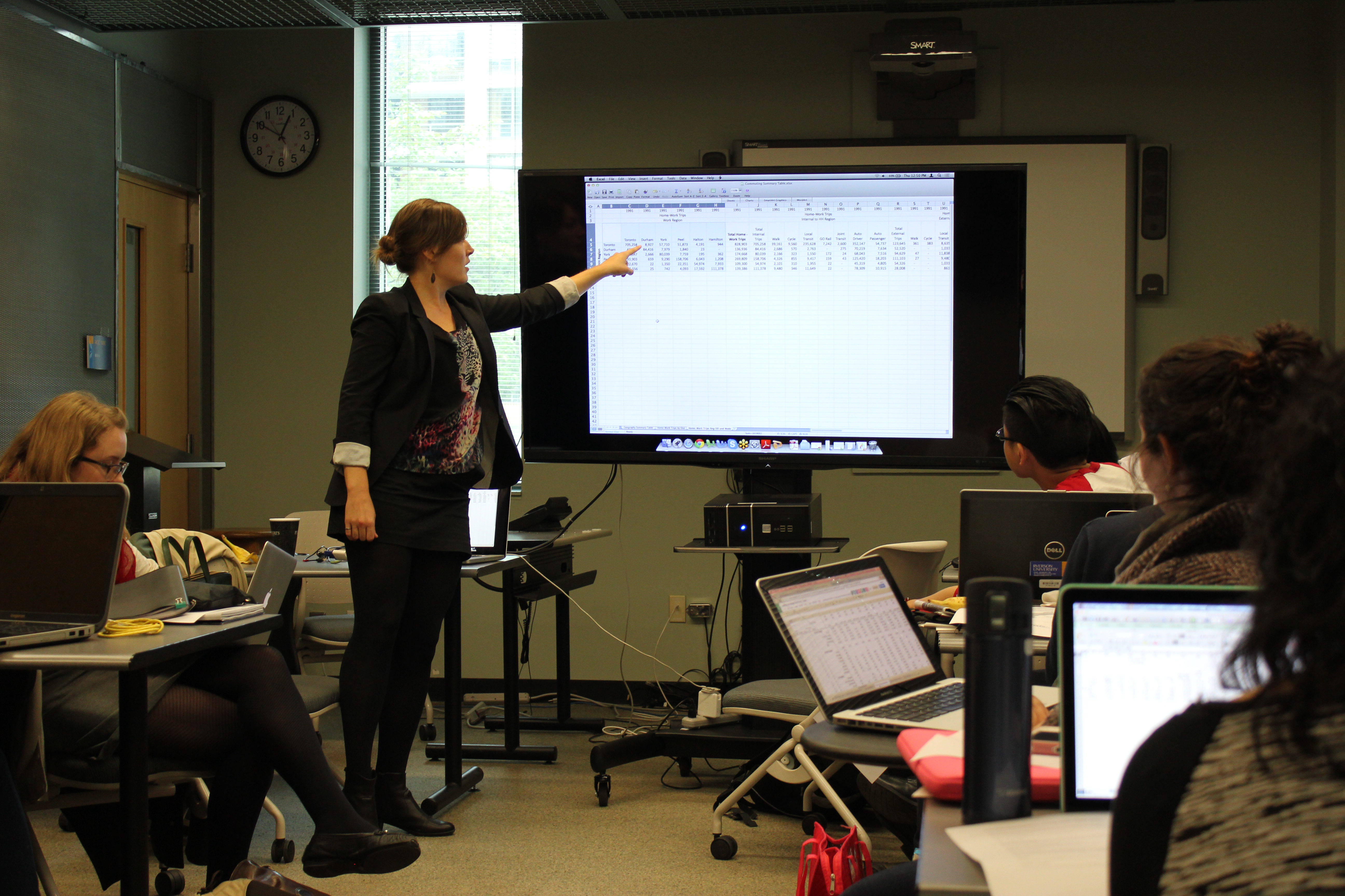
Neptis researcher and transportation engineer, Erin Toop, explains statistics during a Senior Reporting data journalism workshop at Ryerson University on Oct. 9.

By Prajakta Dhopade

I stared blankly at the rows upon rows of transportation statistics on my computer screen. My heart thudded in my chest, my eyes darted to my classmates’ faces. Did they get it? The numbers in the intimidating Excel spreadsheet I was scrolling through didn’t make much sense to me. I thought I’d left math class behind when I came to journalism school.

As the initial panic subsided and I actually took a moment to think about the variables in the data set before me, I began to see how they correlated, how the numbers might raise important questions that could lead to stories I can tell as a journalist.

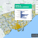
Which of the 16 zones Toronto is divided into has the most cyclists and what does that say about cycling infrastructure in parts of the city? Has there been an increase in people cycling to work? The possibilities seemed endless.

My foray into data journalism occurred in Ryerson journalism instructor Gavin Adamson’s senior reporting class last month when researchers from the Neptis Foundation, a charitable, non-partisan research organization, came to share the results of an unreleased Transportation Tomorrow Survey (TTS) with students.

It was an opportunity for us to produce story ideas from a vast collection of data about the modes of transportation used in the Greater Golden Horseshoe.

The Neptis-led data journalism workshop was organized after April Lindgren, director of the Ryerson Journalism Research Centre (RJRC), and Marcy Burchfield, executive director of the Neptis Foundation, met at the annual meeting of the Canadian Geospatial and Open Data Research Partnership this summer.

“We have partnered with other universities on previous projects and have always had a relationship with up-and-coming planners, [and] transportation engineers, so this seemed like a good fit—to introduce some young, up-and-coming journalists to an important data set that tells a lot about travel behaviour in the region,” said Burchfield.

The TTS is sponsored by the Ministry of Transportation Ontario and is a collaborative effort by regional governments and transportation associations to collect data revolving around how people travel in southern Ontario.

The survey sample is large, involving five per cent of the population in the Greater Toronto and Hamilton Area (GTHA).

Neptis shared summary data for 32 variables with us, meaning there were 1,500 possible comparisons to make during our analysis.

According to Burchfield, while the TTS has been used widely for several years for analysis surrounding land-use and urban development, for a long time it has been behind an archaic graphic user interface that limited its accessibility.

She says Neptis hopes to “break down a barrier of access” so that you don’t have to be an expert to draw conclusions from the TTS.

Erin Toop, transportation engineer and a Neptis researcher, was one of the presenters who condensed the complicated raw information into accessible spreadsheets for us to sift through.

The Neptis team members began their Oct. 9 presentation to my class with an explanation of why combiningstatistics with journalism is so important in seeing the big picture.

“With data journalism, you can actually assemble all the information that is out there and you’re able to see trends, you’re able to see how things come together… [and] share these stories in a meaningful way,” said Phinjo Gombu, a former Toronto Star urban affairs reporter who is now working with Neptis.

The presenters emphasized that the ability to decipher raw data and draw conclusions from the numbers is vital in determining the truth and holding politicians accountable.

As a journalism student, this exercise made me realize that having data journalism skills is a valuable asset to have in an industry that is starting to value digital literacy over much else—but our curriculum is only just shifting to accommodate what the job market demands.

Lindgren said the purpose of the partnership between Neptis and Ryerson’s journalism school was to explore different ways of teaching data journalism.

“It’s quite a challenging thing to do because of the technical requirements…You need to know how to work with spreadsheets and data, so there are several levels of complexity in terms of learning,” said Lindgren. “And also the data are so interesting and the story potential is so great that it was a real hands-on opportunity to do real stories with real data.”

While the Excel spreadsheets prepared by Neptis were much less intimidating than the original data format, we were still faced with the daunting task of tackling numbers and making sense of the 32 variables we were given to work with. Transportation modes, trip purposes, trip rates—how were we supposed to see the trends and their significance?

Adamson says that hands-on work with data helps break down numeracy fears, a critical hurdle for journalists, who often must sift through data evidence to analyze governmental and corporate decision-making.

After Toop gave us an overview of how the survey worked and what each variable represented, the class divided into groups to generate story ideas.

What really worked about the workshop is that we had the Neptis researchers to help us understand the feasibility of comparing variables while our journalism instructors encouraged us to think about how the data related to what’s happening in the city.

We learned to simplify our approach to finding patterns in the data and to think about what our lede would look like.

Fourth-year journalism student Marija Petrovic went on to use the TTS data to write a story for Adamson’s reporting class.

She discovered that cycling within Toronto has increased more than 50 per cent in the past four years as more people choose to ride their bikes to avoid congestion on city roads.

“I liked seeing data that was something that I see happening every day and that is such a big part of a Ryerson student’s life,” said Petrovic, who confessed she found the workshop challenging at times because math is not her forte.

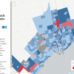
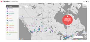
We didn’t come close to taking the data and creating ambitious graphic visualizations like the images shown to us by the Neptis researchers — indeed, following through with the analysis would be another obstacle to tackle— but the exercise got us thinking.

“Although it was a good three-hour workshop, it wasn’t enough,” said Michael Chen, a fourth-year journalism student who attended the presentation.

He thinks it was a great opportunity to look at the data and ask questions but would like to have spent more time learning about Excel sheets and analyzing statistics.

I definitely agree that we needed more time to become comfortable with the numbers; even as I started to figure them out, I still found them overwhelming.

Finding patterns wasn’t easy either, but it was helpful receiving the Neptis researchers’ feedback because it was reassuring to realize we weren’t grasping at straws– that maybe we were onto something.

Adamson hopes to partner with Neptis again for other classes in the journalism program, including the masthead publication, The Ryersonian.

Prajakta Dhopade is a fourth-year journalism student at Ryerson. She is an aspiring online journalist with an interest in women’s issues. Her work has also been published by the Canadian Press.

Cross post from the Ryerson Journalism Research Centre