 By Naomi Bloch
This Wednesday, November 18, marks the 16th annual GIS Day. Throughout the week, Geothink will present a series of posts looking at some of the ways in which our collaborators, partners, and friends around the world are critically examining and using GIS as a tool for civic engagement and understanding.
The community snapshots presented this week highlight diverse perspectives and uses for GIS.
If you make your way to Toronto’s City Hall on Wednesday, you’ll discover that the City is displaying a slideshow of some pretty interesting maps, just above the 3D model of the downtown core. The big-screen projection, set up for Geography Awareness Week and GIS Day, showcases some of the ways that Toronto’s municipal divisions are using GIS to tackle urban issues.
These same projects can also be perused at your leisure via a new City of Toronto GIS Day landing page. The City of Toronto is one of Geothink’s municipal partners.
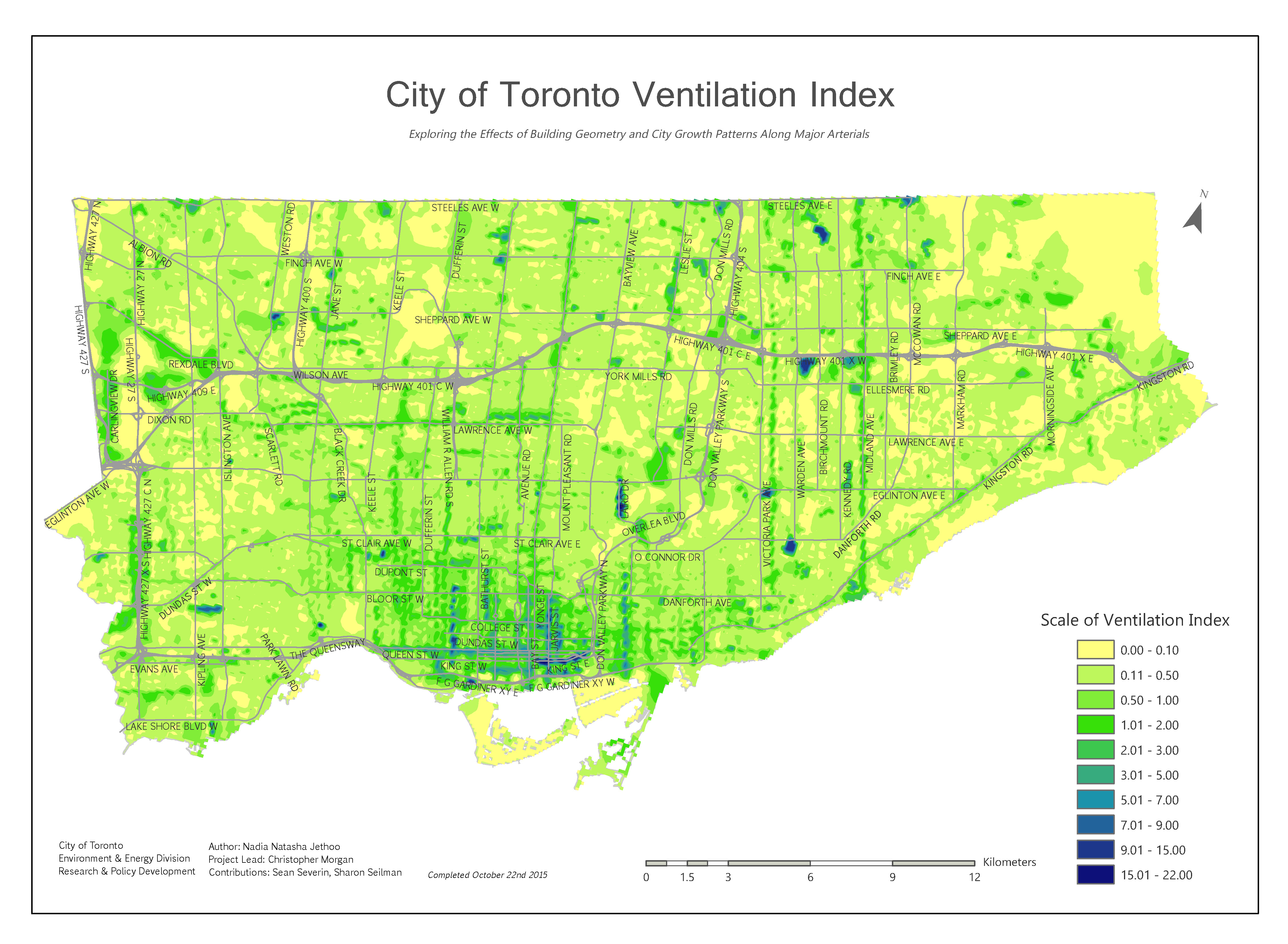
City of Toronto’s Ventilation Index map. All images © City of Toronto 1998-2015. Used with permission.
The breadth of projects may surprise Toronto residents. Take the Environment and Energy Division’s (EED) Ventilation Index. The EED is mapping the city to get a full spatial understanding of areas known as “urban canyons,” narrow open spaces confined between built spaces that contribute to ground-level pollution — a problem most noticeable to pedestrians in the city. The higher the ventilation index, the greater the level of pollution. The Ventilation Index researchers’ goal is to try to identify “how the City’s changing building profile may have growing adverse effects at ground level and how to mitigate and adapt to the rapidly growing City.”
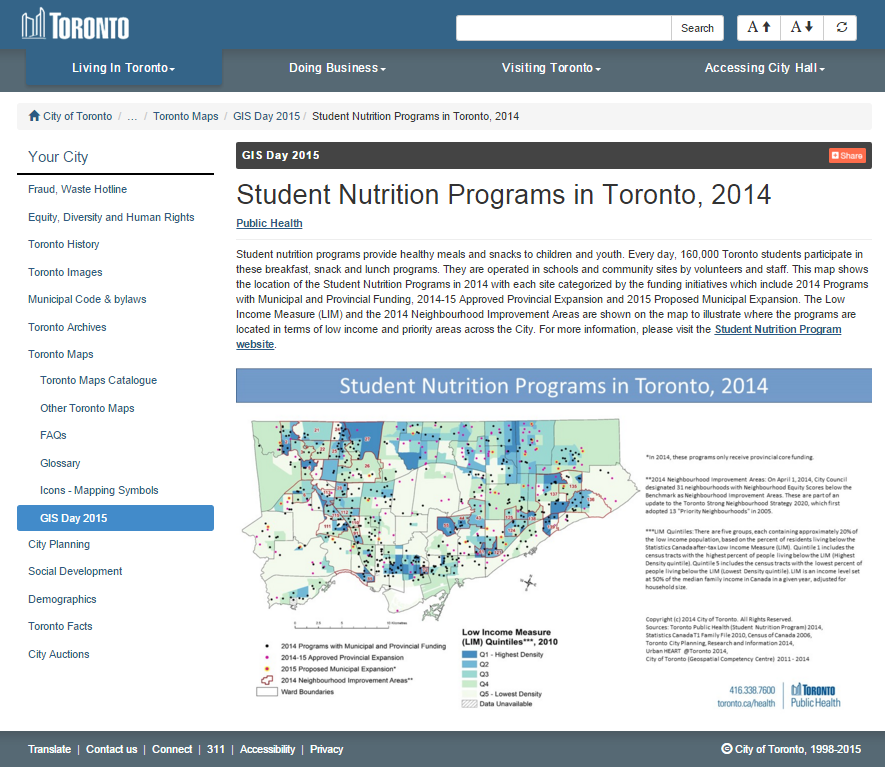
The City’s uses of GIS extend beyond urban planning or trying to understand how urban design impacts the environment. The Department of Public Health, for example, is employing GIS to better understand the distribution and funding of school nutrition programs. In 2014, 160,000 Toronto students participated in breakfast, snack and lunch programs, provided in schools and community sites throughout the city. Public Health has mapped the locations where student nutrition programs were in effect in 2014, with each site categorized based on the funding source behind the program. Incorporating census data such as the Low Income Measure, they’ve identified where meal programs are located relative to the City’s designated Neighbourhood Improvement Areas. This spatial mapping of school nutrition programs helps the City to understand which communities remain under-served and where additional funding should be allocated.
Want to know more about how the City of Toronto is using GIS? Head to Metro Hall on Friday, Nov. 20, anytime between 8:00 am and 3:00 pm. A few staff members from the City’s Geospatial Competency Centre will be on hand to answer questions.
For more of Geothink’s GIS Day coverage, see:
- GIS in the Classroom: Geography and the Law
- GIS on Campus: Join Claus Rinner for GIS Day at Ryerson
- GIS & the Global Community: Humanitarian Mapping
If you have thoughts or questions about this story, get in touch with Naomi Bloch, Geothink’s digital journalist, at naomi.bloch2@gmail.com.