The Local News Map launched by Geothink Co-Applicant Jon Corbett and Partner April Lindgren asks Canadian communities to report how news coverage has changed for them.
By Drew Bush
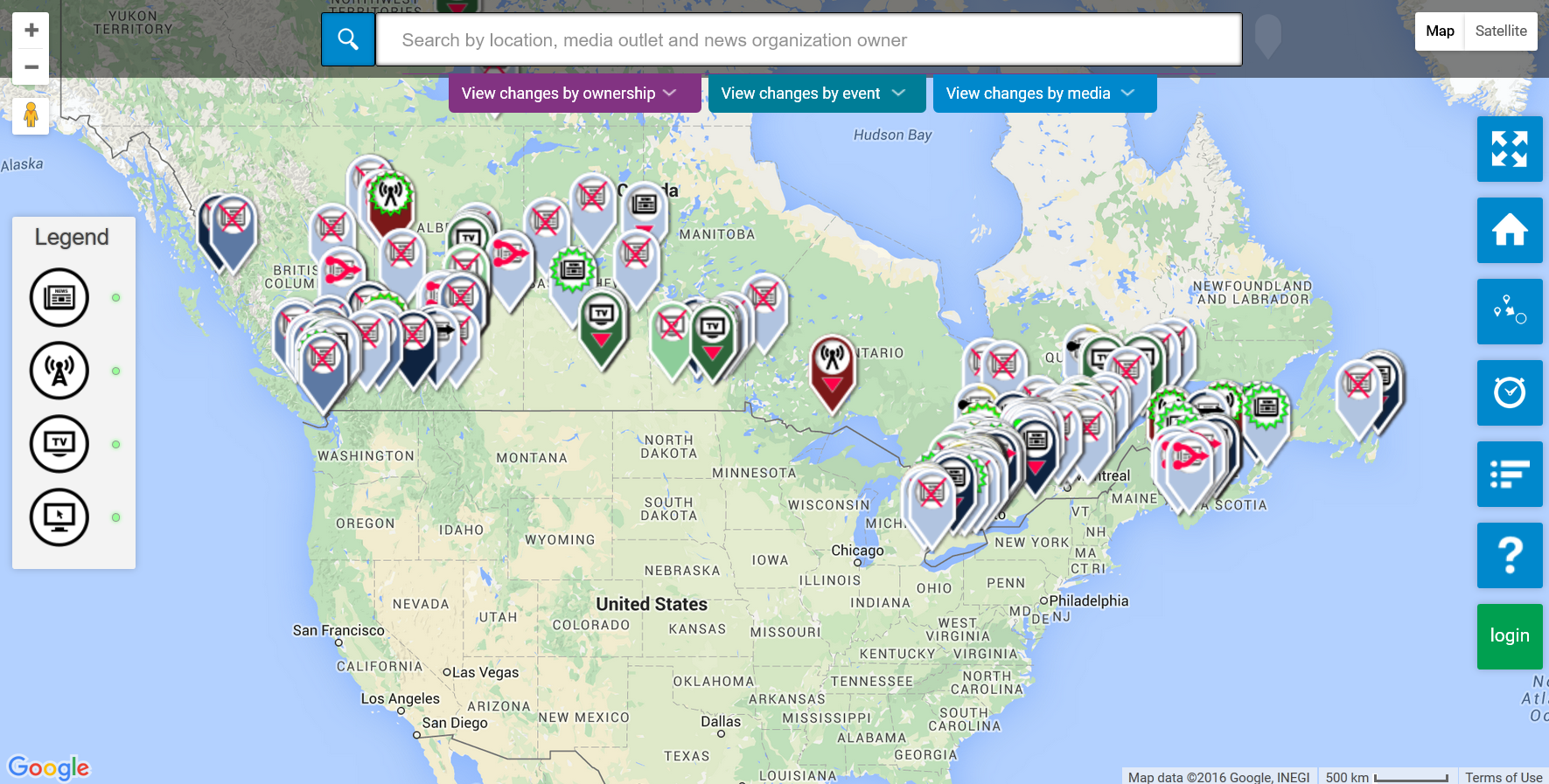
The impact of newsroom cutbacks, consolidations, and closures across Canada will be the focus of a new crowdsourced online geoweb map. The public can contribute to it now—with the full map available online this June.
“The idea of the map is it will allow us to gather data that we have not been able to gather on our own just because there is so much data out there,” said Geothink Partner April Lindgren, an associate professor at Ryerson University’s School of Journalism and founding director of the Ryerson Journalism Research Centre.
The project stems from a belief that Canadians who live in smaller cities, suburban municipalities, and rural areas typically have fewer media outlets to turn to for media coverage. For that reason, the project’s list of communities includes municipalities that have experienced a major disruption in local news sources (such as the closure of a daily newspaper or television station).
The map will be one part of the project “Election News, local information and community discourse: Is Twitter the new public sphere?” that is headed by Jaigris Hodson, an assistant professor of Interdisciplinary Studies at Royal Roads University. Geothink Co-Applicant Jon Corbett, an associate professor in Community, Culture and Global Studies at the University of British Columbia, Okanagan, helped design it with his graduate students in the Spatial Information for Community Engagement (SPICE Lab) using the GeoLive platform featured in previous Geothink research.
“What we did is we went back to 2008 and we tried to find all the instances where a local news organization had either closed or scaled back service or something new had been launched,” Lindgren said in March while the map was being developed. “And so we populated the map as much as possible with information that we could find. But obviously there is lots and lots of other information out there that has happened since 2008. And there is probably lots of stuff going on right now that we do not know about.”
“So the idea of the crowdsourcing is it will allow us to obviously draw upon the expertise and knowledge of the local news landscape of people who live in communities,” she added. “And they will be able to contribute those pieces of information to the map to make it more robust and comprehensive.”
The map can document gains, losses, service increases, and service reductions at local online, radio, television and newspaper outlets across the country. Now that the map is open to contributions, members of the public can add information about changes to the local news landscape in their own communities. The map’s administrators will verify user submitted content so that the map remains accurate.
For a closer look at this project and the map, check out our video. In it, Corbett walks the user through a step-by-step view of the map and how to contribute while Lindgren discusses the importance of this work.
Making the Map
Many researchers have looked at the critical information needs of communities on topics such as education, health, security and emergency responses, Lindgren said. This in turn led her to think about how we know if there is adequate media provision in Canadian communities and where media have been lost or added. Still another related question is what online local news sites or social media have sprung up to fill any missing gaps.
Through attendance at last year’s Geothink Annual General Meeting in Waterloo, Lindgren was put in touch with Corbett. Eight months later, they had created a beta version of the map that included a couple hundred entries. Some emerging trends in the data include the consolidation and closure of community newspapers in Quebec and British Columbia.
“April had this idea that she wanted to better communicate information about how news media had changed over the period of the last eight years or so in Canada,” Corbett says of his meeting last May with Lindgren that began work by his lab to develop the map. “Because there really has been a lot of activity. Some newspapers have gotten larger. Others have closed down. There is a general move to web based media.”
His group has spent months ironing out the technical details of making this map presentable and ready for launch. Lindgren has provided feedback and advice on it through each stage.
“It has been an awful lot more complicated than we originally intended precisely because there has been so much activity and there is so much difference in this type of activity across Canada,” Corbett added. “For example, we have four major types of media. We have newspaper, we have radio, we have TV, and we have the web. And then within each one of those different types, we have a whole series of other information we need to convey.”
For example, the newspaper category of the map alone contains free dailies, free weeklies, and paid newspapers. It also must contain a measure of how such types have either declined or increased in different localities through time.
“And so we see all of this sort of compounding levels of complexity around the data that we need to present,” he said. “Because of course one of the problems with maps is to present information in an effective way require an awful lot of thought about the types of information being presented and how you actually present that type of information. It needs to be beautiful, it needs to be engaging, but it also needs to be informative.”
Corbett’s group has used color, typography, and more to make the map easily accessible to users. But he notes it is still a challenge to display all the transformations from January 2008 to the present. And the issue of time—as it is portrayed in the map—will only become more important as users begin to use it to display events taking place during specific years.
Getting Involved
Lindgren and Corbett are both excited for the map’s launch and the public’s participation. Right now the map needs richer input on new online news sites launched in Canada, Lindgren said. This is an issue she plans to keep an eye on when users begin contributing in greater frequency to determine to what extent these organizations are viable and fill gaps left by the closure of local newspapers and television stations.
Lindgren also believes the map has wide appeal to specific communities including local governments, individual community members, and journalists. She points out that in coming weeks there is a number of ways for the public to get involved.
“First of all, when they add a piece of data, they can comment,” Lindgren said. “Or they can comment on any other developments on the map that they want. And we have also incorporated a survey so that people can fill out the survey and tell us a little bit about where they go for their local news. Whether they feel adequately informed about various topics ranging from politics to education to other local issues.”
In case you missed it in the links above, find the map here to contribute your information: https://localnewsmap.geolive.ca/
###
If you have thoughts or questions about the article, get in touch with Drew Bush, Geothink’s digital journalist, at drew.bush@mail.mcgill.ca.